Phase Two: A Shape Becoming Another, Different Shape

Now that you know the basics behind how frames work, I don't have to explain nearly as much for this part. Basically just open the .png below in MS Paint and have a look:

Subtle changes to the picture between frames is the key to animation, the smaller the changes are between the frames the smoother the animation becomes. Simple(ish).
Each band of colour represents a different frame, each frame saved after adding the band. Here's a picture of what the work folder might look like once you're finished the shape:

Adding transparency: Okay, in step 9 of the first part I showed you how to view layers Inside of GiMP. Open the layers to the shape or whatever you've decided to work on, then go ahead and bring the navigation window and layer tab back up.
Select a layer like so and make sure the little eyeball symbol is deselected on all the other layers:

You'll have to add an alpha channel, sometimes the option to do so is greyed out which means it's already added and you don't have to worry. To add an alpha channel, study this picture intensely:

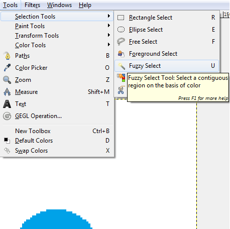
After you add an alpha channel, find the fuzzy select tool:

Using that fuzzy tool, click the white background on the visible layer you selected earlier and hit the DELETE key (by the insert/home/end keys on your keyboard), and you should get something like this:

Go through and do that for each of your layers and you'll have yourself an animated picture that doesn't include an unsightly, ugly, downright disgusting background to it.
(If your picture is transparent, you'll have to set the frame disposal like this:)

That's the basics to creating high-quality pieces of art such as "moving stick man":

or maybe even a "fart ghost":

Tips
1) Generally, the smaller the picture, the easier it is to animate
2) It's probably a good idea to make a test .gif every couple frames to make sure everything is looking all right, it's often a huge pain in the ass to fix something that went wrong after you've already made 40 frames.(If you look closely at the bottom C in the "content creator" gif below, you'll see what can happen. No fucking way i'm going to try and fix that)
3) Creative Convention has a thread about pixel art and a lot of the technique there will help you make better-looking stuff
4) Keep hydrated
5) Listen to one or even both of these albums
Follow these instructions and you'll become a

This Week on Something Awful...

Pardon Our Dust
Something Awful is in the process of changing hands to a new owner. In the meantime we're pausing all updates and halting production on our propaganda comic partnership with Northrop Grumman.

DEAR FURRIES: WE WERE WRONG
Dear god this was an embarrassment to not only this site, but to all mankind

Let's improve landmarks
Landmarks and statues around the world: old, boring and could use an update.

Make Horror Wholesome
Join the SA Forum photoshop goons in their quest to make horror wholesome!

Every Conceivable Way EA Could Screw Up Star Wars: Squadrons
Yes, there are finally enough games for a new round of One Sentence Reviews
About This Column
Photoshop Phriday showcases the tremendous image manipulation talents of the Something Awful Forum Goons. Each week they tackle a new theme, parodying movies, video games, comics, history, and anything else you can think of. If you want in on the action, join us on the Something Awful Forums!
Previous Articles
- Gary Oldman, Star Citizen!
- Nightmares Fear Factory: Newest Nightmares!
- The Rowdy Trout!
- Nightmares Fear Factory: New Nightmares!
- Everyone Is Big Boss!