Windows 8 takes Microsoft's cell phone UI and attempts to integrate it with the desktop experience. Some people say that the result is the biggest operating system advancement in decades. Some say that small touchscreens are vastly different from traditional keyboard+mouse setups with larger screens, and that Windows 8's option to disable the new UI is proof that this is will have limited usage in the real world.
After spending some time with the recently released preview build, I have some insightful, brilliant thoughts.
The Home Menu

Pretty self-explanatory. This slick and elegant screen provides easy access to absolutely everything you'd ever need. If, for example, you want to be reminded that Internet Explorer still exists, there's a button. If you want to shop on Microsoft's marketplace (and who doesn't?), there's a button. Conveniently, it's a different color so you don't get confused. If you like ads - sorry, recommendations - and lots of white space, you're all set.
Gone are the start menu, taskbar, and desktop. In their stead, the realization that bright colors and large rectangles exist.
The Options Plinth

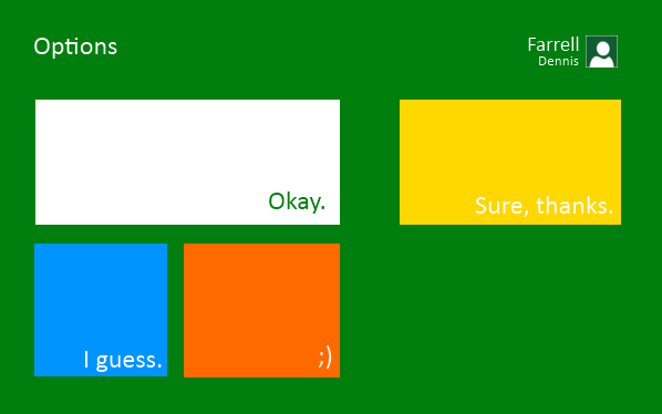
With the new straightforward UI, some people were worried that power users would have a hard time getting into the deepest levels of the system. Obviously, those fears were unfounded. Here we see the full Options Plinth, which replaces the ancient, decrepit Control Panel. You can choose from several options. They all seem pretty good!
Microsoft Game Center Xbox For Windows Marketplace

Every few years Microsoft renews their forgotten promise to focus on PC gaming, and this time around they've finally done it by integrating Games For Windows Live. By "integrating", I mean that it exists and you can open it.
GFWL still lacks many of the features that you love on Steam, doesn't have a wide selection of games, doesn't put games on sale very often, the overlay is still clunky, it still causes problems such as arbitrary save game deletions, and it's sort of obnoxious about updating itself. It does, however, have Microsoft's name on it, and you can use it to do really exciting things such as purchasing exclusive DLC or buying Microsoft Xbox dollar points.
If you want to play a non-GWFL game, you simply click on one of the appropriate colored shapes, then on the silhouette of a person playing a video game, then on the colored rectangle with a silhouette of a mermaid. You'll know you've gone too far or taken a wrong turn if you see a throbbing blue square with a silhouette of an Olly Ross silhouette portrait.
MWOOORRP

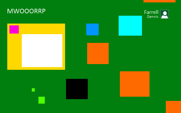
Here we have the MWOOORRP screen. Surprisingly, this is identical to the version we've been using since Windows XP. To be quite honest, it's disappointing to hear Microsoft boast so much about their revolutionary UI, then leave this vital part of the OS untouched.
HHH Eating A Sandwich

This is the first time that the UI has given me pause. Although I like the bold, clean look of Windows 8 in general, it seems to limit the amount of instances of HHH Eating A Sandwich on the HHH Eating A Sandwich panel. In an ideal UI, we'd see at least twenty - if not fifty - pictures of HHH eating a peanut butter and jelly sandwich with a bandage on his head.
Thankfully, this is a preview build. There's still plenty of time between now and release, so with any luck Microsoft will put their top men on HHH Eating A Sandwich.
Conclusion

–
This Week on Something Awful...

Pardon Our Dust
Something Awful is in the process of changing hands to a new owner. In the meantime we're pausing all updates and halting production on our propaganda comic partnership with Northrop Grumman.

DEAR FURRIES: WE WERE WRONG
Dear god this was an embarrassment to not only this site, but to all mankind

Let's improve landmarks
Landmarks and statues around the world: old, boring and could use an update.

Make Horror Wholesome
Join the SA Forum photoshop goons in their quest to make horror wholesome!

Every Conceivable Way EA Could Screw Up Star Wars: Squadrons
Yes, there are finally enough games for a new round of One Sentence Reviews
About This Column
The Something Awful front page news tackles anything both off and on the Internet. Mostly "on" though, as we're all incredible nerds.
Previous Articles
- The Reificant: Brave
- The Festooneried Fables of Groggery Gibbonman
- Memos from Bear Cave: Man's Reach (Part 1)
- #SaveDerpy!
- PC-COP!